Data Interpretation - Line Charts
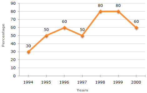
The following line graph gives the percentage of the number of candidates who qualified an examination out of the total number of candidates who appeared for the examination over a period of seven years from 1994 to 2000.
Percentage of Candidates Qualified to Appeared in an Examination Over the Years
The differences between the percentages of candidates qualified to appeared for the give pairs of years are:
For 1994 and 1995 = 50 - 30 = 20.
For 1998 and 1999 = 80 - 80 = 0.
For 1994 and 1997 = 50 - 30 = 20.
For 1997 and 1998 = 80 - 50 = 30.
For 1999 and 2000 = 80 - 60 = 20.
Thus, the maximum difference is between the years 1997 and 1998.
The graph gives the data for the percentage of candidates qualified to appeared and unless the absolute values of number of candidates qualified or candidates appeared is know we cannot compare the absolute values for any two years.
Hence, the data is inadequate to solve this question.
The number of candidates appeared in 1998 be x.
Then, 80% of x = 21200  x = x = |
21200 x 100 | = 26500 (required number). |
| 80 |
The total number of candidates qualified in 1996 and 1997 together, cannot be determined until we know at least, the number of candidates appeared in any one of the two years 1996 or 1997 or the percentage of candidates qualified to appeared in 1996 and 1997 together.
Hence, the data is inadequate.
The number of candidates qualified in 1999 = (80% of 26500) = 21200.
 Number of candidates qualified in 2000 = (33500 - 21200) = 12300.
Let the number of candidates appeared in 2000 be x.
| Then, 60% of x = 12300 x = |
 |
12300 x 100 |  |
= 20500. |
| 60 |