Data Interpretation - Line Charts - Discussion
Discussion Forum : Line Charts - Line Chart 5 (Q.No. 2)
Directions to Solve
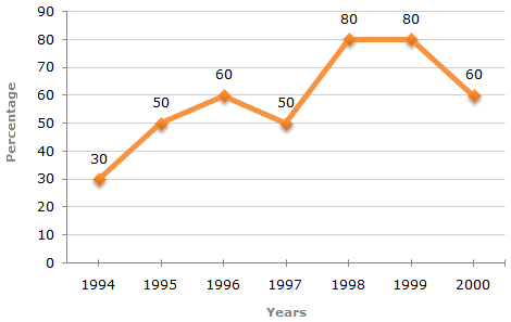
The following line graph gives the percentage of the number of candidates who qualified an examination out of the total number of candidates who appeared for the examination over a period of seven years from 1994 to 2000.
Percentage of Candidates Qualified to Appeared in an Examination Over the Years
2.
In which pair of years was the number of candidates qualified, the same?
Answer: Option
Explanation:
The graph gives the data for the percentage of candidates qualified to appeared and unless the absolute values of number of candidates qualified or candidates appeared is know we cannot compare the absolute values for any two years.
Hence, the data is inadequate to solve this question.
Discussion:
4 comments Page 1 of 1.
Deepti said:
8 years ago
The graph here is mentioning about the percentage of students qualified but not the students who appeared. Since we do not know the number of students appeared for the exam over the period of seven years so the answer will be D.
Dhananjoyreang said:
9 years ago
I can't understand. Explain.
D.P said:
9 years ago
Here, the number of students appeared for the examination is may be different or not.
So we can't decide. Therefore, answer data is inadequate.
So we can't decide. Therefore, answer data is inadequate.
Jyoti said:
1 decade ago
In this problem, we have the same of number students appeared for the examination for the all seven years i.e. we have the same number students for 1998 and 1999 because we are taking it for the whole seven years. Then in this we have 80% of total of students in both the cases. Then how can we say that we don't have the proper data.
Post your comments here:
Quick links
Quantitative Aptitude
Verbal (English)
Reasoning
Programming
Interview
Placement Papers