Data Interpretation - Line Charts - Discussion
Discussion Forum : Line Charts - Line Chart 5 (Q.No. 1)
Directions to Solve
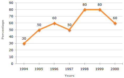
The following line graph gives the percentage of the number of candidates who qualified an examination out of the total number of candidates who appeared for the examination over a period of seven years from 1994 to 2000.
Percentage of Candidates Qualified to Appeared in an Examination Over the Years
1.
The difference between the percentage of candidates qualified to appeared was maximum in which of the following pairs of years?
Answer: Option
Explanation:
The differences between the percentages of candidates qualified to appeared for the give pairs of years are:
For 1994 and 1995 = 50 - 30 = 20.
For 1998 and 1999 = 80 - 80 = 0.
For 1994 and 1997 = 50 - 30 = 20.
For 1997 and 1998 = 80 - 50 = 30.
For 1999 and 2000 = 80 - 60 = 20.
Thus, the maximum difference is between the years 1997 and 1998.
Discussion:
2 comments Page 1 of 1.
VIPIN vashist said:
1 decade ago
Appeared candidates are same in every year as the percentage Of qualified candidates is right appeared candidates (100).
So the difference in percentage is asked between qualified and appeared among the following options.
So the difference in percentage is asked between qualified and appeared among the following options.
Yahoo said:
1 decade ago
Sir ,
Here we are not comparing with the previous years .We are talking about the difference so it is in 1998 and 1999.
Kindly Clarify me.
Here we are not comparing with the previous years .We are talking about the difference so it is in 1998 and 1999.
Kindly Clarify me.
Post your comments here:
Quick links
Quantitative Aptitude
Verbal (English)
Reasoning
Programming
Interview
Placement Papers